An interesting and likely underappreciated aspect of Ready Room is that the shape of the inspection board is a visual representation of the state of the inspection. If, for instance, most of the task cards are over on the left, then either the inspection has just gotten underway or the team is really struggling. If the cards are bunched along the top, then the team is firing on all six cylinders, completing existing tasks as fast as new ones are being introduced.  Besides the shape of the board, various other metrics are available to the team to help paint a richer portrait of an inspection. One can see the total number of tasks in each tab (active, staged, mine, and all) and the number of tasks and attachments in each state (fulfill, review, etc.). One can even see the mean time it takes for a request to be released to an inspector. Still, we can do better. With the latest release of Ready Room we are pleased to introduce metrics and analytics.
Metrics and Analytics
Ready Room users (except restricted SMEs and inspectors) will find a new button in the inspection board’s upper-right corner with an image of a bar chart on it. Clicking that button will bring users to a new page which presents 12 graphical and textual components broken into three sections that together give viewers an immediate sense of the state of the inspection. Keep in mind that these graphs, while animated, are not “live.” That is, as the data changes beneath them, they do not redraw. Instead, users can either click the refresh button in the upper-right or simply reload the page in order to capture the latest changes.
Metrics
The first section shows some simple counts on the left and a number of “doughnut” graphs on the right, showing counts and percentages. The counts are visible when you hover over a component of the doughnut. In this section, you can see the percentage (and number) of tasks in each state, labels in use, attachment counts by file type, and more. By clicking on the legend items you can hide and show those graph components. Furthermore, some graphs, such as “Request Status” allow you to toggle among active, staged, and all requests. 
Continuous Flow Diagram
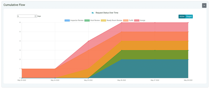
The next section is arguably the most useful as it contains what is known as a “cumulative flow diagram” (CFD). If the other graphs on this page allow you to understand the current state of the inspection, the CFD shows how you got there and allows you to take action. In a follow on post, we will discuss CFDs and their use in GXP inspections in detail, for now let it suffice to say that the CFD shows the “flow” of an inspection over time. With that information, it is possible to tell at a glance if the team is floundering or flourishing. A CFD is an area chart showing the state of the inspection at the end of each day, thus it becomes more and more rich and more and more useful as the inspection progresses. The X axis is time (in days) and the Y axis is the number of tasks. The graphed elements (the areas) are the different states (columns) a task can be in: assign, fulfill, ready room review, host review, and inspector review). In other words, the backlog (assign column) is on top, the completed items (inspector review) on the bottom, and the in-process items are in between.  What you’re hoping to see when viewing a project’s continuous flow diagram is all of the chart components moving steadily towards the upper right corner and of approximately equal width. That means that as quickly as tasks are being added, they are being completed. If, on the other hand, you see things flatline as above, that means the whole inspection has stalled (or it’s the weekend). If, on the other hand, the orange area is much larger than any other it may mean that the subject matter experts are not being responsive enough or they are context switching too often. As you can see, the rightmost section of the CFD is essentially the same information as the inspection board itself (as was discussed at the beginning of this post) except that the CFD is rotated clockwise 90°. The rest of the CFD to the left is just looking backwards in time. Note, the CFD defaults to showing 7 days. If you are in week two or three of the inspection, don't forget to increase this value. The CFD for old inspections will always look flat as it will be looking backwards from today. Also note, that you can toggle this view between staged and active, which is useful for tracking progress in the weeks leading up to the inspector’s arrival.
Analytics
The last section presents various counts as either bar or stacked graphs. These include the following:
- Number of requests per state per assignee
- Number of requests per state per inspector
- Mean time to release by assignee
- Mean time to release by inspector
- Number of requests per label per assignee (not shown in screen shot)
- Number of requests per label per inspector (not shown in screen shot)
 Some graphs contain a “Stack/Group” toggle. In the image above, the top-left graph is stacked and the bottom-left is grouped.” With these charts you can answer questions such as, “Who has handled the most requests marked urgent?” or “Which team member has the most unfulfilled requests?” or “How long is it taking to deliver responses to the inspector?” As a final note, you should be aware that this post contains exactly 1,000 words, including these words that you are reading right now. Why? Because that’s how many words a picture is worth. Given that there are 22 different renderings, that’s 22,000 words worth of information! We hope that you find these metrics useful. If there are any other metrics you’d like to visualize, please let us know.