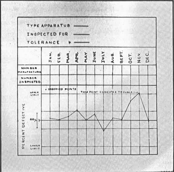
Our next pioneer of quality is Walter Shewhart, a physicist who worked as an engineer at Western Electric and Bell Telephone. In 1924 Shewhart, in response to a colleague’s request for an inspection report on equipment defects, mocked up a graph that plotted the percentage of defective equipment units identified each month against the mean and “control limits,” or the outer limits of tolerability for the measurement. If the percentage of defective parts stayed within the control limits over time, then the process was operating as intended, within the expected (or “common cause”) variation. Any value above the upper control limit or below the lower control limit “indicates trouble,” per Shewhart’s annotation. “Trouble” is variation due to a “special cause,” which could be investigated, identified, and mitigated, so the entire process was brought back into a state of control.
You’ll recognize statistical process control from its appearance in E8 and E6 as “quality tolerance limits,” rebranded in E6 R3 as “acceptable limits.” Per E6 R3, sponsors should set acceptable limits to “support the control of risks to critical-to-quality factors.” For example, a slide deck co-developed by ACRO and Transcelerate gives three examples of QTLs for a study of a drug whose expected adverse effects include anaphylaxis:
- X% of participants experiencing allergic reactions
- Y% of participants terminating early
- Z% of missing endpoint data
X, Y, and Z represent upper tolerance limits based on previous data of the same compound.
As we think about how these foundations of quality currently express themselves in our current GCP quality management system, keep this example in mind and compare it to how Shewhart originally intended statistical process control to be used:
Purpose. Statistical process control enables users to learn in real time when external factors are affecting a controlled process, causing unacceptable quality levels. This knowledge enables us to take action to bring the process back within acceptable limits, thus reducing waste.
In the Transcelerate example above, a deviation from the upper tolerance limit for allergic reactions could signal a process out of control – for example, we could exceed the upper acceptable limit for allergic reactions because clinical sites are over-reporting data because they misunderstand the protocol, or because the EDC system is difficult to use and they are mistakenly entering data twice. On the other hand, they could be reporting allergic reactions because the drug is causing allergic reactions. The response to the first scenario would be to gain better control of the process; the response to the second scenario is to follow up on the safety signal and take steps to keep participants safe.
Time. Statistical process control is intended to visualize changes to a single process over time. Time is important in a manufacturing setting because some variations in quality can be explained by conditions that change over a period of time or occur at a certain point in time. For example, if the percentage of defective widgets increased gradually over the month of August, it might be due to a bolt on a machine that became increasingly loose over the month. If the percentage of defective widget skyrocketed on August 15 (“this point indicates trouble”), it might be due to a bolt that fell out of a machine on that date.
The Transcelerate examples don’t look at allergic reactions, early terminations, or missing data at data over time, just overall percentages. Does this affect the utility of this method? This brings us to our next point.
Variation. Statistical process control holds the promise of being able to differentiate special cause (conditions that affect quality to an unacceptable degree) from common cause (conditions that affect quality, but within tolerable limits) via the eight rules for variation. Under these rules, users of statistical process control would react to the following:
- One data point more than three standard deviations from the mean
- Nine consecutive points above the mean or below the mean
- Six consecutive increasing or decreasing points
- Fourteen consecutive points oscillating between increase and decrease
- Two out of three points in a row that are more than two standard deviations from the mean
- Four out of five points in a row that are more than one standard deviation from the mean
- Fifteen points in a row that are all within one standard deviation of the mean on either side of the mean
- Eight points in a row, none of which are within one standard deviation of the mean, on both sides of the mean
Without plotting data over time, we don’t get a sense of variation.
Control limits. A simple way of calculating upper and lower control limits is to calculate the average and standard deviation of the average process data, then add three standard deviations to the average to get the upper control limit and subtract three standard deviations to get the lower control limit. The symbol for “standard deviation” is the Greek letter σ, or sigma. The term “Six Sigma” is derived from this calculation.
A more precise way involves the use of two charts: The X-Bar chart and the R chart. This page gives a relatively easy-to-follow explanation. Both charts use subgroups of data – for example, 20 subgroups with 4 observations each. The X-bar charts plots the average of each subgroup to allow the user to visualize the variation between samples (the signal). The R chart plots the range of each subgroup to allow the user to visualize the variation within each sample (the noise). Control limits for both the X-bar and the R chart are calculated using formulas that rely on constants based on the size of the subgroup.
Both methods rely on the availability of process data to make the calculations. In clinical research, when limited data are available from previous studies, and it is not practical to wait until one hundred observations are amassed to calculate X-bar and R, more sophisticated methods are required. This paper describes Pfizer’s use of simulated data to set control limits. Page 12 of this paper compares these statistical methods to the “bright line” method—an intuitive way of setting a single Quality Tolerance Limit based on the observed rate in a previous study. It concludes that the statistical method has a 6.7% false alarm rate while the bright-line rule has over twice that rate.
Some questions to ponder as we consider how this manufacturing quality technique is being used in clinical trials:
- In our efforts to establish quality tolerance limits, are we confounding safety signals with process control?
- Are we losing the effectiveness of statistical process control by not looking at changes to data points over time?
- Are we doing more harm than good when we use "bright line" (non-statistical) methods for setting quality tolerance limits?
In our next post, we'll discuss W. Edwards Deming's contributions to quality management.